Our world is constantly evolving with the rise of big data and the interconnectedness of people.
There are various of methods we use to help us understand seemingly complex information. From applying visual charts to colourful demographics, we are always finding ways to communicate complex concepts to the masses.
The Venn diagram is a practical visual tool for effective communication for the relationships of different variables.
Let’s begin with just 2 variables to represent the human population.
Set A: Males
Set B: Wears Glasses
We can categorise everyone into 4 different groups which is represented in the Venn diagram below.
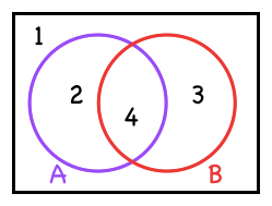 Figure 1: 2 variables
- Neither Male Nor Wears Glasses
- Male & Never Wears Glasses (A only)
- Wears Glasses & Not a Male (B only)
- Male & Wears Glasses (A & B)
We shall take it up a notch by adding another variable to the example above.
Set C: Fluent in English
 Figure 2: 3 variables
- NONE
- Only a Male
- Only Wears Glasses
- Only Fluent in English
- Male & Wears Glasses
- Wears Glasses & Fluent in English
- Male & Fluent in English
- All of the above
So far so good. Should we keep going by adding another set to the diagram?
Not so fast! It seems intuitive to do so, but there won’t be enough regions(represented by the numbers) if we have 4 sets. Let’s find out below.
Based on the 4 variables labeled A, B, C & D, there are the 16 possible groups, starting with the first group with zero variables up to the 16th group containing all 4 variables.
- NONE
- A
- B
- C
- D
- AB
- AC
- AD
- BC
- BD
- CD
- ABC
- ABD
- ACD
- BCD
- ABCD
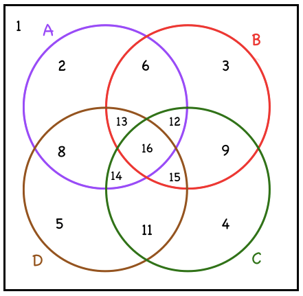 Figure 3: 4 variables
Since there are only 14 regions in the diagram above, it would not be possible to represent two of the groups(7 & 10) in the Venn diagram above. What a bummer.
Is there a way to represent 4 variables using a common shape for all the sets?
The solution can be found by not going around in circles. There are plenty of other shapes to choose from. With some perseverance & aimless sketches, a shape to be used. If you’re the kind of person who enjoys figuring things out, stop here to avoid looking at the solution below.
Hint: its not a circle 🙂
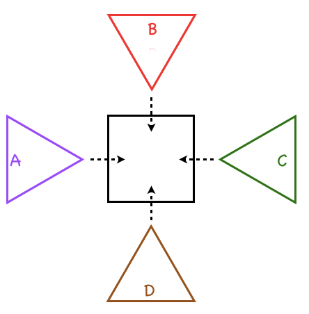 Figure 4: Solution to 4 variables
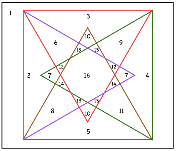 Figure 5: Full Diagram of Solution
The solution above is just one of the ways we can represent 4 different variables in a diagram.
By using 4 equilateral triangles packed in a square shape, there would be enough regions to represent 16 groups. Furthermore, 6 of the groups can be represented by 2 regions.
Another way to visualise the solution is by cutting 4 pieces of triangles with different colours & placing them onto a piece of square paper with similar side length. Regions 2,3,4 & 5 will only be as thick as a single piece of paper while Region 16 will be the thickest as it contains all 4 triangles.
So what happens next? Can this shape work for 5 variables?
That’s for you to find out!
Thanks for being here, till next time folks!
Bonus: Did you observe any pattern from the above post?
There is a simpler way to find out the number of groups based on the amount of variables.
For 2 variables, there are 4 groups
For 3 variables, there are 8 groups
For 4 variables, there are 16 groups
Hence, # of groups = 2ª (where a is the number of variables)
